Richard Welland is a designer and art director with over 20 years experience working in music and art, both as a creative director at Warner UK and independently at his own studio, R-W Studios.
Over the course of his career Richard has collaborated with a diverse range of clients and artists such as Liam Gallagher, Biffy Clyro and Royal Blood.
Being interested in all forms of art, Richard explores multiple mediums to create his work, such as print, 3D, collage and illustration, combining his love of music and design into a successful design career in the music industry.
In this chat, Richard talks about leaving the larger, corporate environment to run his own studio. He also touches on style, some of his personal favourite projects, and his latest work with Biffy Clyro on A Celebration Of Endings and the upcoming The Myth Of The Happily Ever After.
I also ask Richard for some music recommendations, which you can find here and have a listen if you are interested. Enjoy!
Far too many to say a favourite.
Avril 14th - Aphex Twin
Wish I did but no.
It’s all very subjective but I think you can find inspiration in the most smallest and most insignificant items / environments etc. The key is to keep your eyes and mind open to everything.
A very small design high street company wanted an assistant to help the main design team produce local ads and brochure work - hated every minute and left after a month.
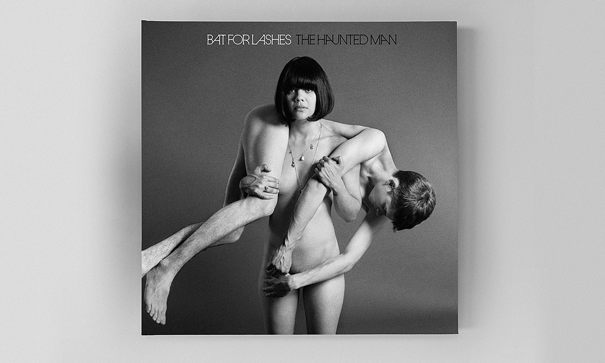
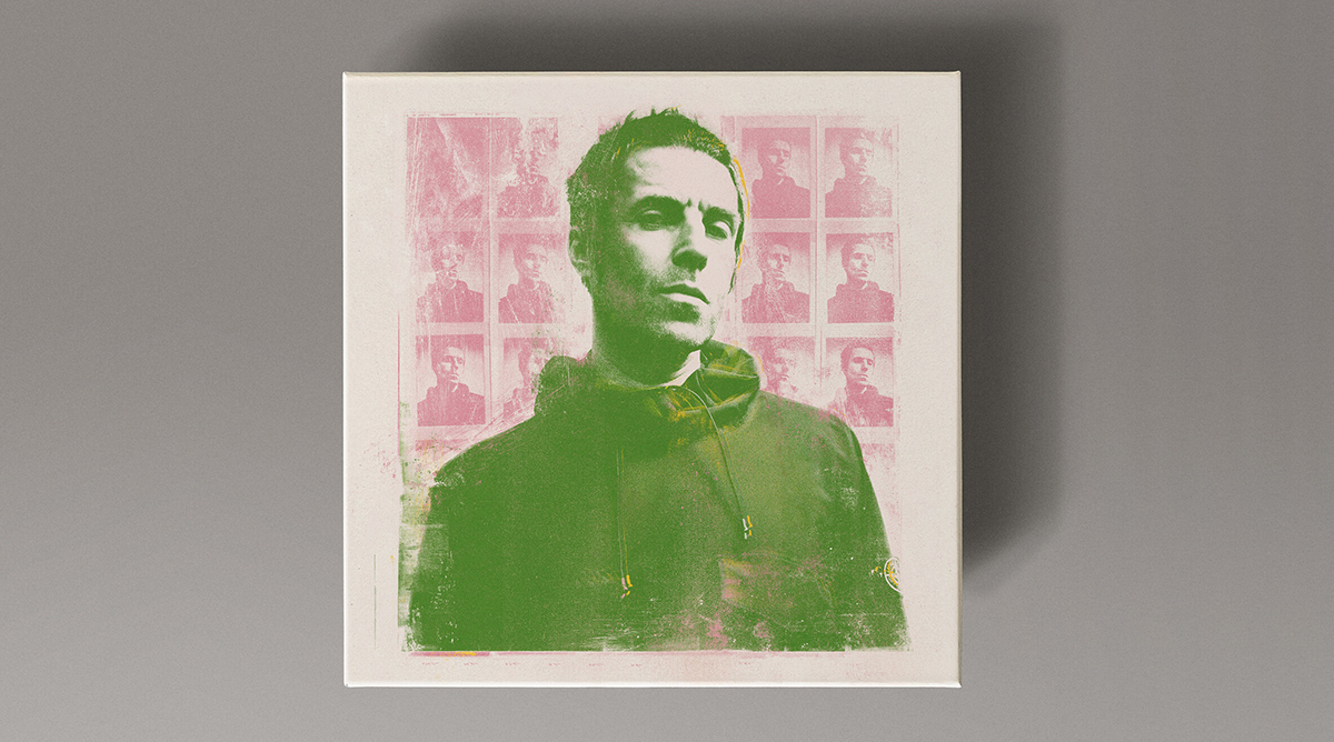
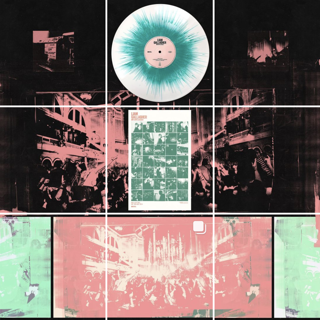
I’ve been extremely lucky to work and collaborate with a very wide range of clients; I guess one was with Natasha Khan (Bat For Lashes) and the Haunted Man. She’s amazing how she brings a whole formulated story to life in music and then translates that into a visual piece; the other was with Liam on the Why Me? Why Not. album. Obviously the two are quite far apart musically with the latter being very labour intensive with every image having to be treated in some way, either by intricate cut n paste methods or printing techniques, but quite therapeutic in a weird way.
The larger setup did feel quite corporate and sometimes strangely restrictive with so many people working on or within projects at different periods. That aspect is still there to a certain degree but you're not really exposed to those confines when working the studio environment so you tend to go with your instinct or gut feeling if something feels right or not - i.e. many conversations with yourself.
Just me at the moment, the idea is to keep things small.. big isn’t always better.
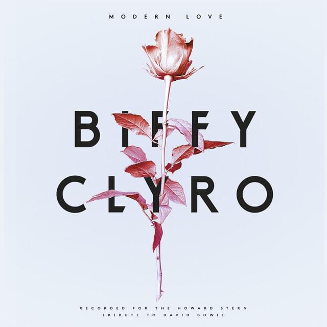
One of the first was Biffy Clyro’s ‘Modern Love’ single.
There’s always been a keen interest in design and music so it seemed natural to couple the two together and make something work within it. My dad was into Hendrix and Floyd so that rubbed off in some way, definitely in terms of Storm Thorgerson imagery. School was a bit of a chore.... interesting lessons but I inevitably ended up doodling something on the back of my text book with only art classes only really holding my attention.
I try to treat the platform as a secondary folio in a way to get projects out there, it's over the 1 ‘billion user’ mark so think it's something that can’t be ignored as an outlet for any kind of creative work. The digital platform isn‘t going away anytime soon.
I like the raw and unpolished and unpredictable feel to it and that each feels unique in a way; back in the 90s I was drawn to Californian based Creative director David Carson and his work with experimental typography methods that felt quite anarchic and a step away from the mainstream approach to graphics and layout.
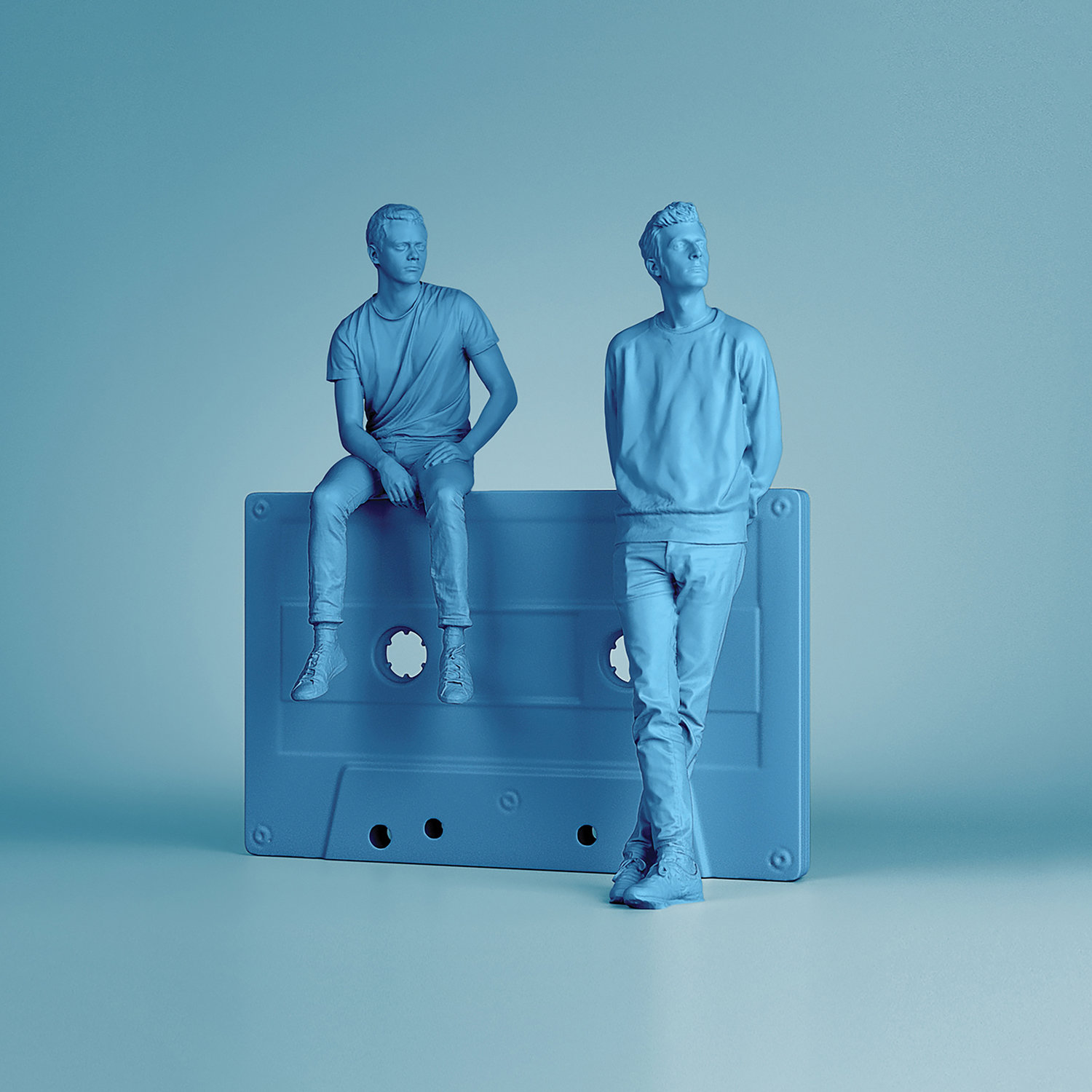
Not really, I think any designer / creative should be able to diversify into a brief and understand what the client wants; the work I did with French duo Basic Tape for example was the complete opposite to the work with say Liam or Biffy for instance, with full body 3D scanning and rendering them into an environment complete with their reel to reel tapes to sit on. Obviously sometimes you get identified with certain work but its also what the project needs to answer the brief.
Working as an Art Director at Warner UK for a good while I was lucky enough to meet with some amazing artists first hand, which gave you insight to the music and the people behind it first hand. Talking directly with that person can be quite vital as briefs can on occasion be misleading and always throw up questions regarding a possible route or a how to interpret with a few ways to approach it. I don’t think there’s a direct route to work in music and personally don’t feel work should be directly targeted toward it but ideally do what you do and what you feel comfortable with and go with that.
I feel over the past 5 - 6 years its definitely seems to have sped up in requiring assets quicker and turnaround deadlines; obviously this can be detrimental to the project so planning ahead is always a must in most areas of any project.
Definitely, whenever possible - If you have good working relationship with the artist, label or client, you may, on occasion get to hear a few tracks to gauge the overall sound which can sometimes conjure up an idea in itself, something a written brief sometimes lacks.
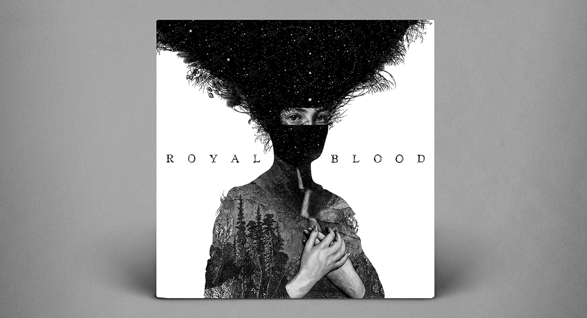
I do remember the guys being signed and we got to hear the first track in an A+R room at the label and was taken aback that the sound only came from the two guys. We first used a friend of Mikes for the first few singles but when we approached the album Dan Hilliers came into frame with the intricate monochrome detail. He was approached and delivered two submissions - I personally loved both but collectively opted for the ‘Pachamama’ option which became synonymous with the release.
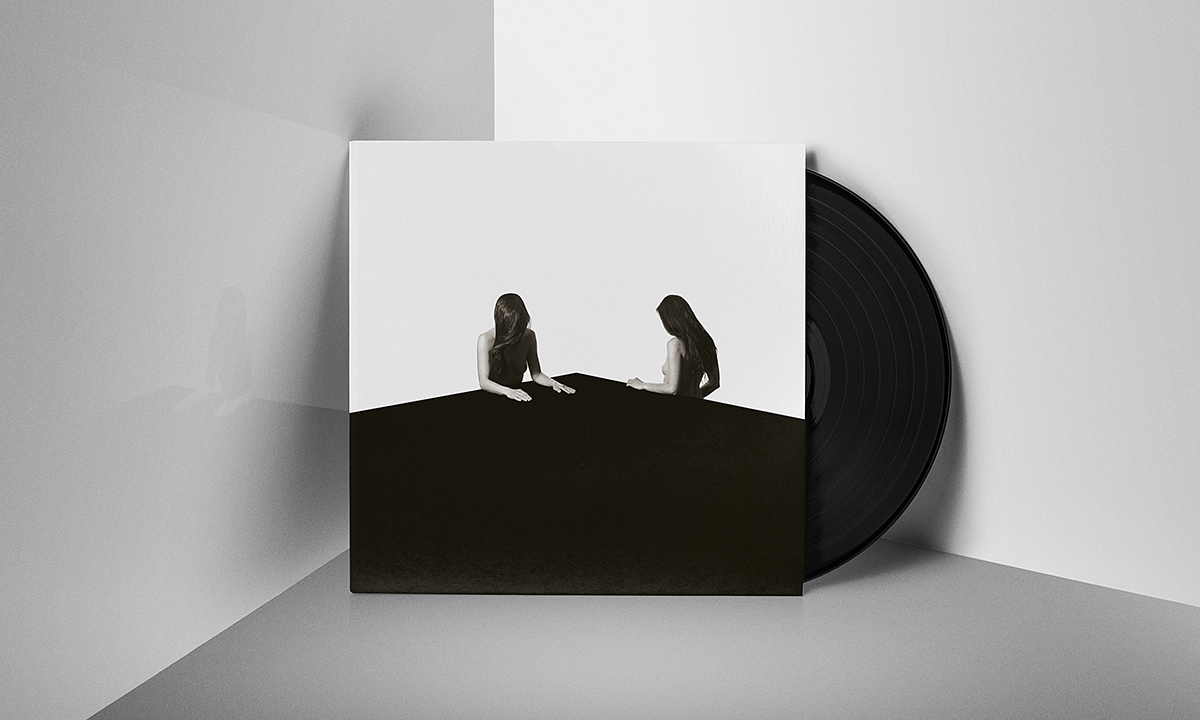
The second album development took a while due to the band in recording session schedules etc but eventually Mike fired over a moodboard and background thoughts most of which were based around a monochrome palette - eventually the guys settled on an image that was originally taken a while back by Adrian Samson. I wanted to keep the album as sparse as possible, using the angle of the platform the two figures were sitting at, as a continuous graphic line or theme that didn’t have any surface texture. I then worked the image so they then were facing away from each other so as the complete landscape image could be conveyed as a beginning and end of a relationship or ‘opposite’ image to one another.
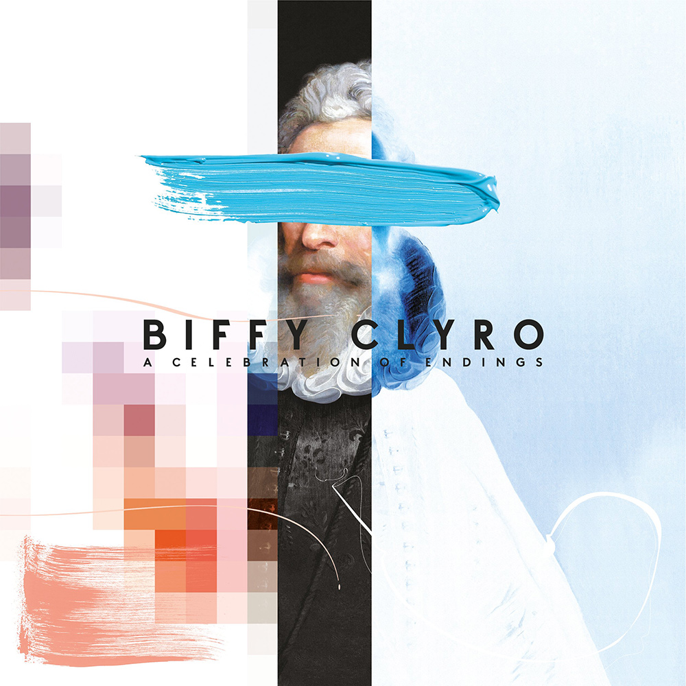
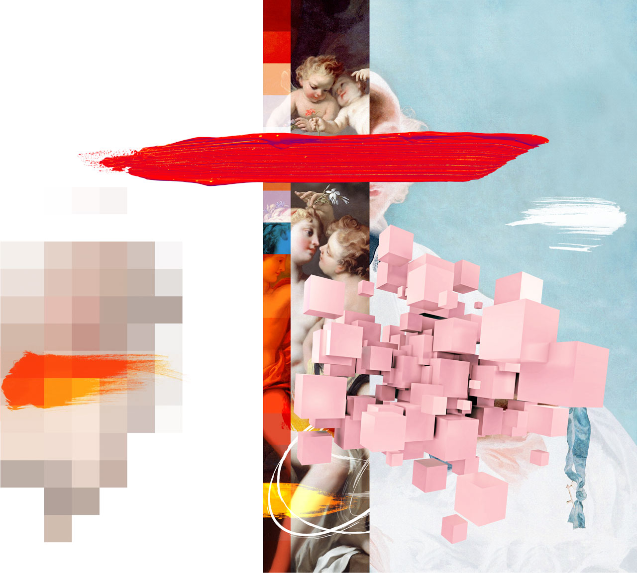
Think I‘ve worked four now as well as singles, all of which Simon is very much involved. For ‘Celebration’ + ‘Myth’ Simon was drawn toward Thomas Robson‘s work with the bold imagery, digital collaged textures. The two sleeve images, once approved with the band, were a ballmark and theme through the rest of the direction for the artwork and subsequent imagery. On both I collated the images that we had of the band and started collage, paint around and treat each spread individually; some of which were taken to a point, photographed then manipulated again on screen to get the desired effect that worked in tandem with the sleeve aesthetic. Simons idea with both was to acknowledge the vulnerable side of human nature and make what we can from all of the chaos, say goodbye to the old and embrace the new - chaotic but calm.
I also remember the MTV album - after seeing the stage set from the gig one of the routes I took was collage a ton of foliage, leaves and textures and positioned them in a certain way to make them cascade from the sleeve... this process continued for various parts of the direction of the artwork so we had the over arching feeling of being immersed in a forest environment.
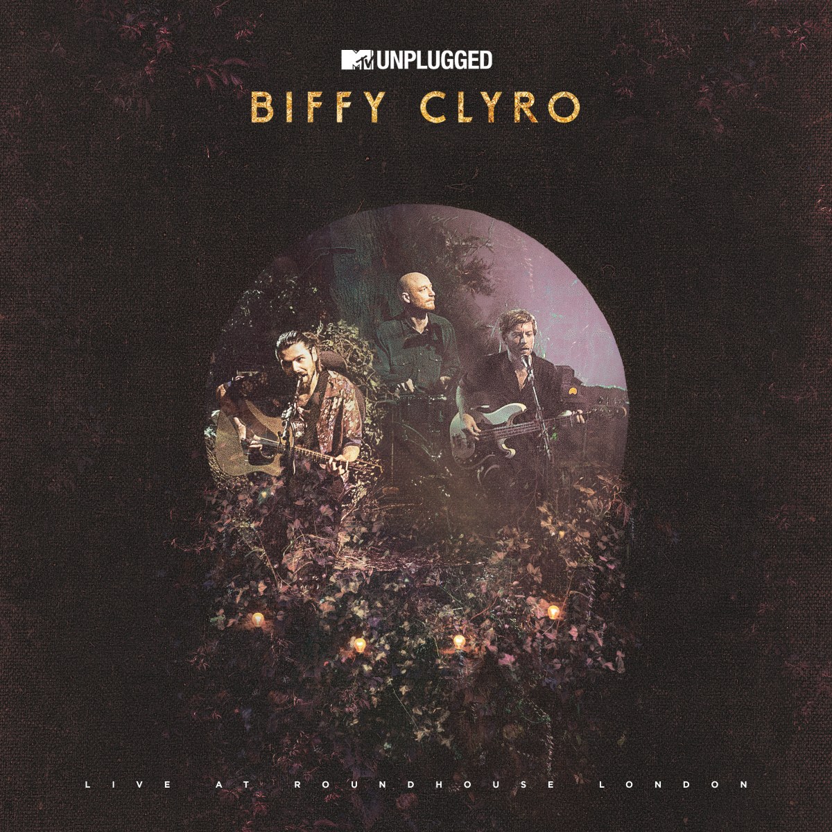
Once I chatted to Simon and the guys there was quite a clear direction we wanted to go in terms of theme with the combination of stylised shots with a chaotic undercurrent. It was a quite a long process from start to final delivery treating each page with collage and other mediums etc but the guys were over the moon so it was cool.
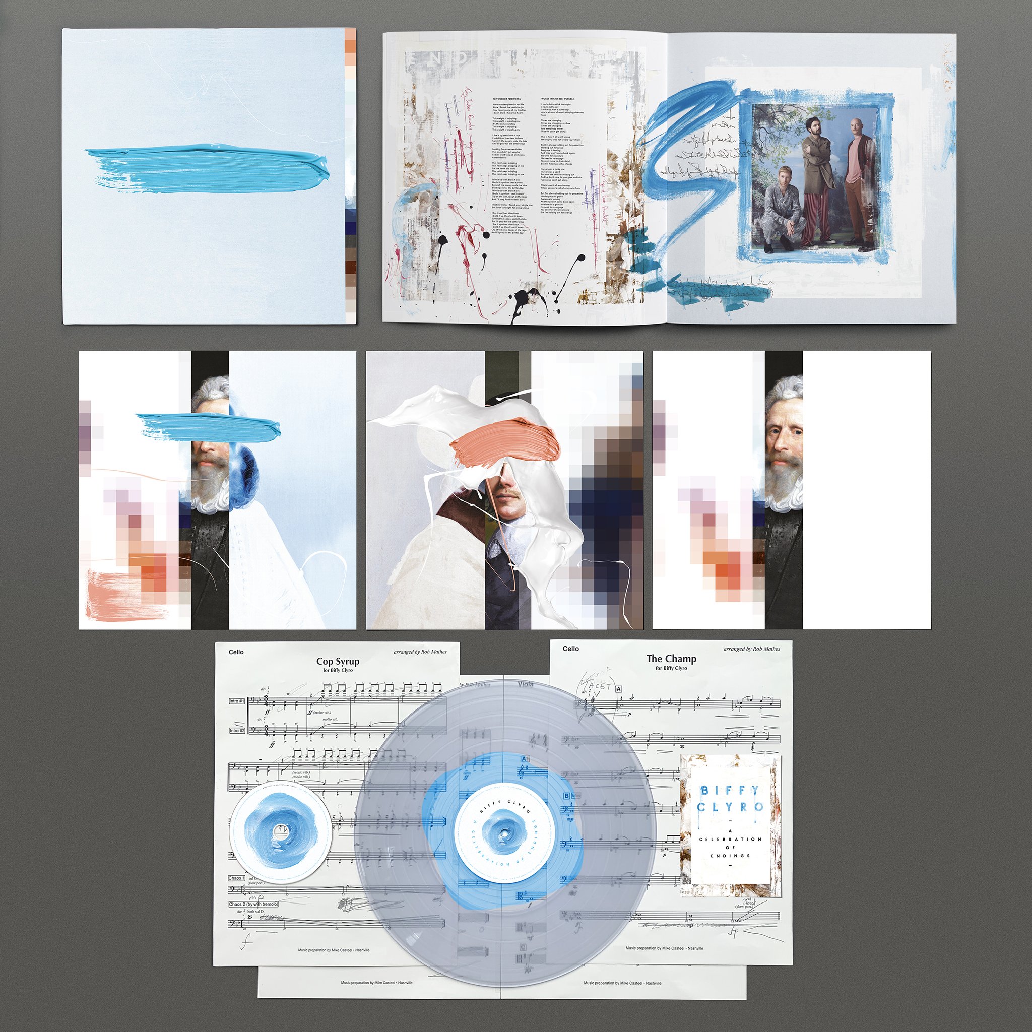
From what I remember it was a colour Simon was drawn toward but something we wanted to continue as a theme for the artwork; this was dominant on the deluxe book we did which also featured the spot gloss and slight emboss on the brush stroke.
From what I remember I heard one track but after talking to Simon he explained the reasoning and why so I tried to deliver as much as possible in terms of content imagery and explain my interpretation to what I’d heard and what we‘d spoken about so to emphasise his idea.
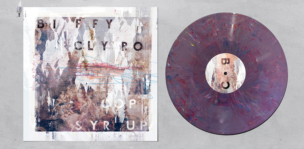
No, there was a significant gap - the ‘Myth’ album was treated as sister album replacing the blue theme with the red theme along with a conscious decision to make more chaotic and sporadic with more collage work on the inside imagery and possibly less minimal in a way but to retain the balance from the last album. I guess ‘Cop Syrup’ was a prelude to the second album in terms of direction with ‘Errors’ being done a week or so after the final album was delivered to production.
‘You only get out what you put in’!
Having the pleasure to work with Liam again on the new album and a new Stereophonics which involved a take / homage to Roy Lichtenstein work and drawing the elements / graphics but have recently worked with a small independent band that I enjoyed as a departure from the larger campaigns. I also did a series of prints at the beginning of the year; some personal, some commercial, so may look into producing some more in between the more commercial work.
I‘ve a varied taste in music always depending what mood I wake up in; The Brian Jonestown Massacre and The Telescopes are two I’ve been listening to lately.