I was approached by a friend of a work colleague to create a fitness e-book that reads like a cooking recipe. Needless to say I was instantly interested in the concept.
Over time the project grew from just an e-book to a full-blown printed version too. After a lot of work we landed on a book that I couldn’t be more proud of.
Realm Fitness / Nick Longhurst
Print Design
E-Book
Photo Editing
Branding
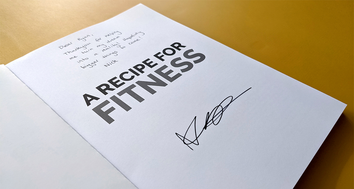
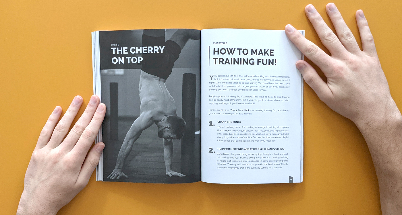
Getting to actually hold a book that I designed in my own hands was a pretty cool experience.
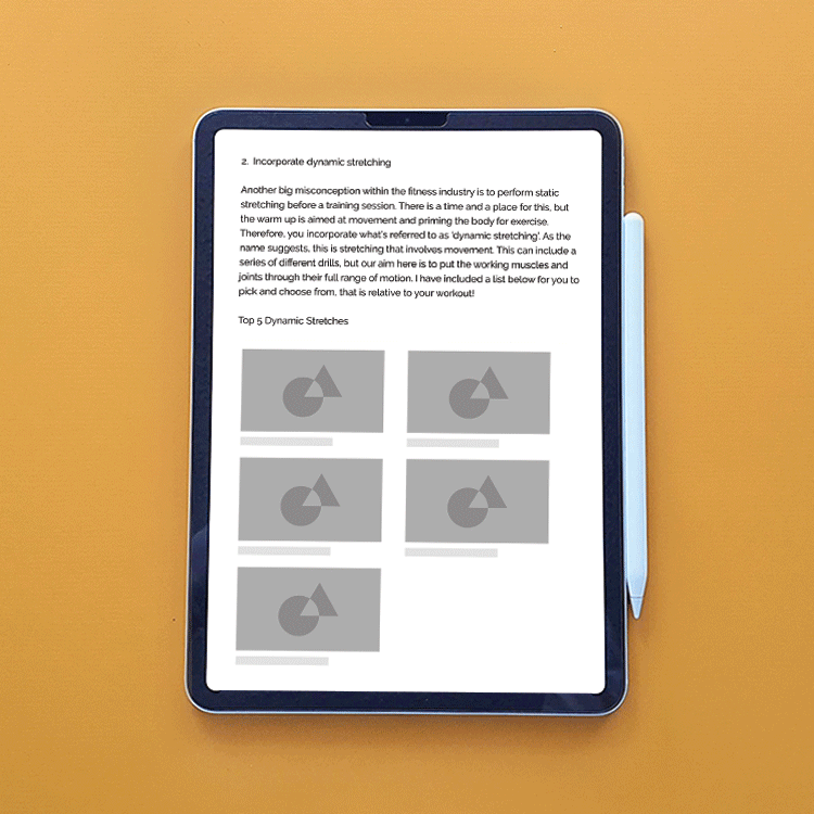
Starting from a Google Doc, we structured the content with a wireframe to help visualise it as a real book. Then we added placeholder imagery. With more revisions we slowly refined the final design.
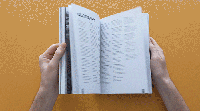
There’s just something special about a real, physical book isn’t there? How it feels to flick through the pages, the smell of the fresh ink on paper, it’s an experience. Knowing that, I put a lot of care and attention into the design on the printed version of the book to make the reading experience as good as possible for any future readers.
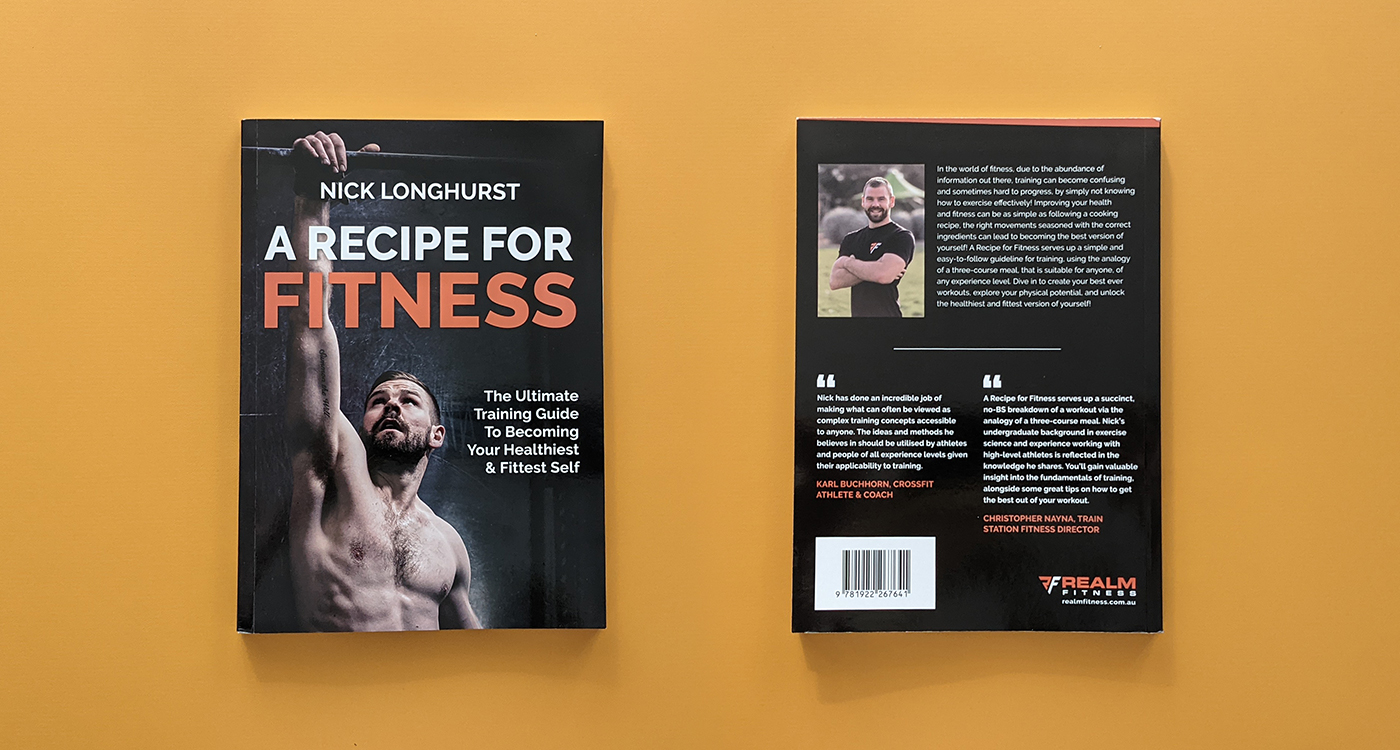
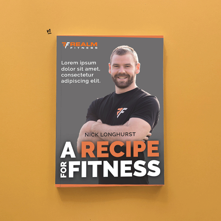
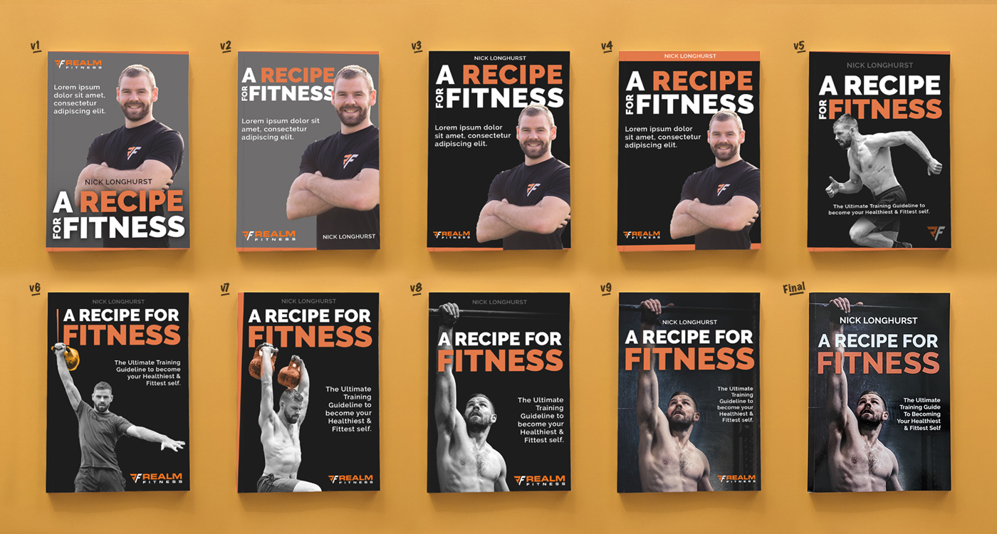
People are going to judge this book by it’s cover, so the design had to be spot on! The most important page in the book requires an extra amount of effort. Here you can see the mutliple variations we went through before landing on the final design.
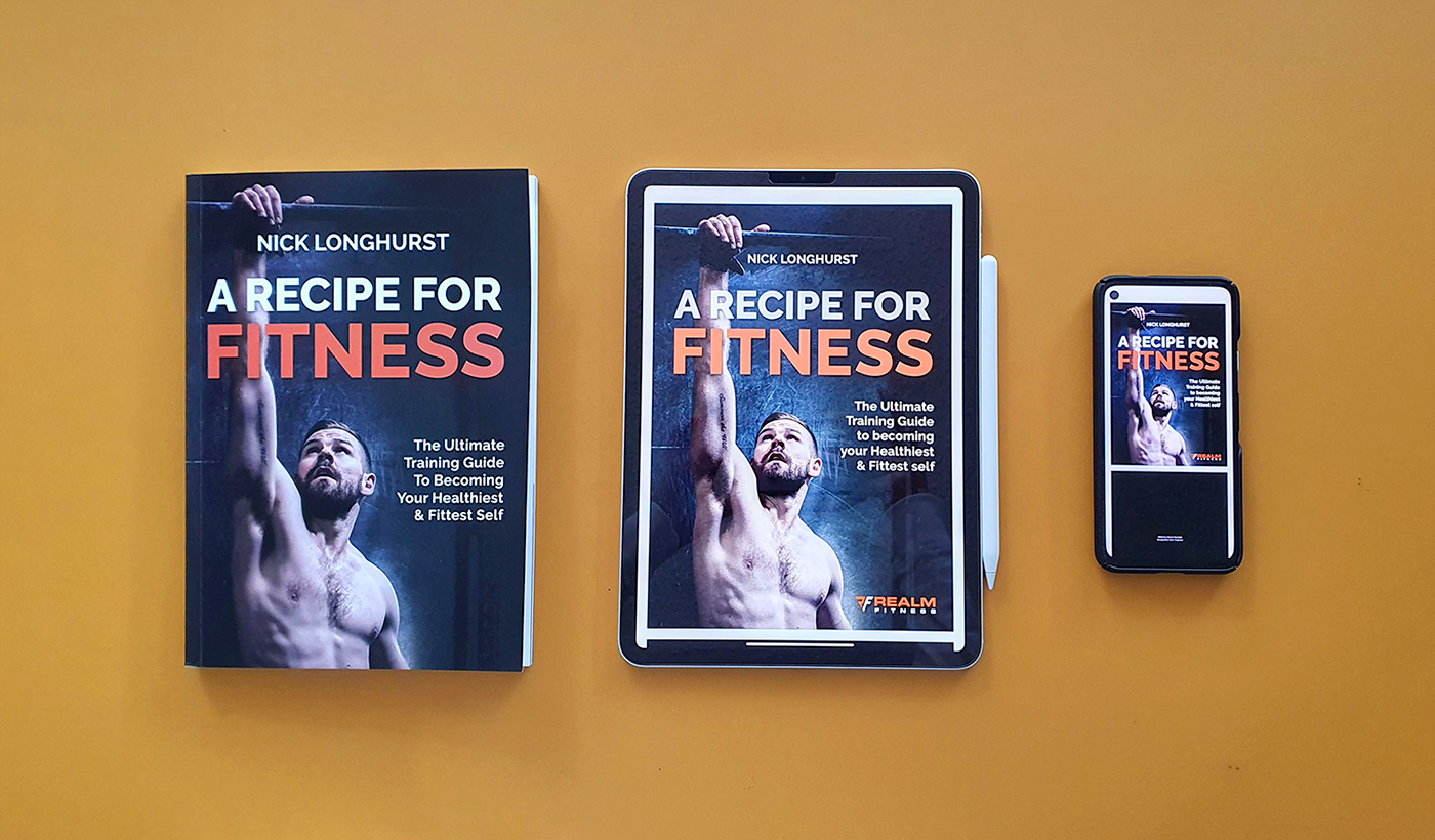
The e-book version gave us the chance to show off the book in full colour. I wanted to ensure a good reading experience whether someone is reading on their computer, tablet, or their phone while on the toilet. Hey, I’m not going to judge.